Fri 6 Jul 2012
by Josef Hoffman
In my view, the vast majority of cover illustrations for present-day crime novels are boring or even ugly, and that includes all subgenres. Worst of all are the uninspired photographic covers with images of a pistol or a knife, a house or a street, one or more people, especially if these have nothing whatsoever to do with the plot of the crime story.
There is not much point in pining for times past, when covers were still drawn or painted and suggested significant scenes of the crime story. It would seem to be the wrong approach to simply imitate the style of the cover illustrations of the 1950s, for example; and this is also wrong even if the old crime novels are reissued.
For instance, I hesitate to buy the recently published book containing the collected stories of the Black Mask author Paul Cain (The Complete Slayers), as I feel put off by the much-praised illustration by Ron Lesser on the cover. It shows a scantily clothed, sexy young woman with a cigarette and a gun, with which she appears to have just killed a man.
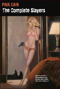
My distaste for this cover illustration has nothing to do with “political correctness†or even prudery, but rather with historical consciousness. I would have preferred it if original cover illustrations from old Black Mask editions had been used for the cover of the book, for example as parts of a collage.
It’s not as if I do not also enjoy so-called “GGA†(Good Girl Art), but only when it originates from the same period as the publication of the books. Back then it was something new, a daring venture that only just escaped the censors. Nowadays one is practically bombarded with pictures of more or less naked people everywhere. Relying on sexploitation to create cover art is dull and annoying.
Taking a historical view, I can even appreciate such an extreme and infamous, frequently reproduced cover image as Rudolph Belarski’s The Doll’s Trunk Murder by Helen Reilly (Popular Library, # 211) from 1949. It is so bizarre and surreal that even any misogynist tendencies that might exist are neutralised aesthetically.
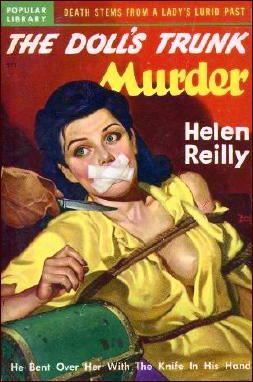
The picture shows a pretty young woman tied to a chair. Her mouth is sealed with adhesive tape. Her blouse is open, revealing much of one breast. A male hand holding a knife approaches the woman. The observer cannot tell whether the intended use of the knife is to abuse the woman, to kill her, or to cut through her fetters. The picture has a thrilling, explosive effect.
Such an image would have quite a different impact on me if it were painted and published now, in 2012. As mentioned, I am not talking about “political correctness†here, which is sensibly applied to political speeches, news and similar statements, but which has no place in artistic products, even if they are merely lurid entertainment.
What I mean is a contemporary taste. A relatively good solution to the problem was found by Black Lizard Books in designing the newly reissued, old noir crime novels. The cover illustrations by Kirwan capture the sinister atmosphere of these crime stories without imitating the original covers, as is sadly the case with some of the covers in the Hard Case Crime series.
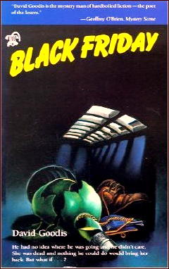
Here is a link to Kirwan’s covers he did for Black Lizard. I do not like them all equally, as I find some of them too surreal, but most of them are well done. One I think is very good is the one he did for Black Friday, by David Goodis. The atmosphere is so hopeless and the colours are so cold that the picture suits the story.
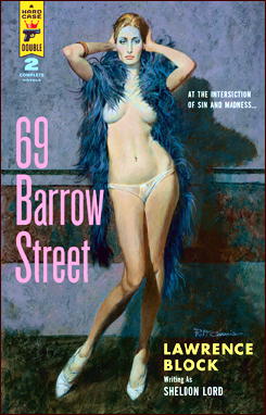
A complete collection of the Hard Case Crime covers may be found here. An example of one I consider bad is the picture of Lawrence Block’s 69 Barrow Street. It is rather unimaginative to put just a nude in the middle of the cover, not exciting at all.
Much better is the cover art of No House Limit by Steve Fisher. These big dice in front of the picture symbolize chance in life and are significant for the novel.
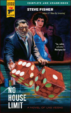
Perhaps the publishers’ art directors should look around at some comic artists in order to find new visual forms of expression that might suit crime novels. Admittedly, it costs more to pay these artists for their work (which should also require that they read the crime novel in question) than it would to simply use a more or less suitable picture from a photo archive, or to plunder one from the masterpieces of art history.
It involves more effort and expense to create a new picture than to select one that already exists. By the way, it is only acceptable to use a painting by Caravaggio on the cover of a crime novel that is published now if the story deals with the robbery of such a painting, or is set during Caravaggio’s time.
It might well be that I have suffered a surfeit of crime novel cover art and am therefore hypercritical. I know of no ideal solution. Perhaps some other crime lovers have better suggestions.
July 6th, 2012 at 8:46 pm
I don’t object to a modern day take on sexploitation type covers. But I wish they’d get the period right.
When I’m reading an old book I see it as being set in the time it was written, unless the text itself implies otherwise, such as with historical fiction or sci-fi. I understand the Paul Cain stories and novel are from the 1930s, so I’m left wondering why a woman who likes like she belongs in the 1960s is on the cover.
I agree that the cover of 69 Barrow Street is pretty bad. And woman looks like Ayn Rand.
July 6th, 2012 at 10:02 pm
That Cain cover was so annoyingly out-of-period that it stopped me from ordering the book when I saw the book with its cover on a site several months ago (was it here?)…
July 6th, 2012 at 11:17 pm
I’ve been collecting the original paintings used on pulp and paperback covers for quite awhile now. I bought my first cover painting in 1970, it was used as the cover for a magazine in 1939 called COMPLETE DETECTIVE. I thought it was beautiful but my wife hated it and refused to let me hang it on the wall. Over the years, she eventually realized the value and beauty of original art, which after all is very unique. There might be thousands of copies of the book in existence but there is only one of the original cover painting.
I mention the above simply to show that this is a subject that I’ve been concerned with for over 40 years and all I can say to Josef Hoffman is that so called “good cover art” is a very subjective thing. What I find stunning and collectible, he might think is ugly and worthless.
For instance he finds the cover for 69 BARROW STREET to be “…unimaginative to put just a nude in the middle of a cover, not exciting at all.” He may be right but he is talking about Robert McGinnis, one of the best of the paperback cover artists. His style was simply to show a very thin, very pretty girl, often nude or almost nude. The books that he illustrated must have sold well because he was used so often. There has been at least one book written about his art. Among collectors of original paintings his work is widely admired and often quite expensive.
Sex sells I guess and readers of pulps and paperbacks loved to see a damsel in distress. But with Robert McGinnis, she did not even have to be in distress, just nude.
When I was just a kid in the middle fifties, one of the things that made me a book collector, was the cover art by James Avati for the Signet paperbacks by Erskine Caldwell. I found the girls to be very eye catching and they often were just portraits of pretty girls showing some leg, etc.
As I said, appeciating art is a very subjective subject.
July 6th, 2012 at 11:53 pm
The basic reason for cover art is to make you pick up an unknown book sitting on a bookshelf in a bookstore. Then the cover should give you a clue about what type of reader would enjoy the book. Compare the half naked people on a romance paperback to the half naked people on a men’s adventure book.
During the fifties and sixties the naked woman cover promised a forbidden story filled with sex and violence. Unlike today where the naked woman or half naked man is an overused visual object, in the fifties such paperback covers was one of the few places the mass audience could see the naked girl. It sold even if it meant hiding it in a brown paper bag until you got home.
While covers have made me pick up a book at the bookstore, I have never bought a book just because of the cover and I have never not bought a book because of the cover. But then I am a content guy, to me only the words matter.
#3 Walker, I have a nice collections of comic strip originals. These are the large original art of the cartoonist before the syndicate converts it to proofs for the newspapers to run. My reason for collecting is similar to yours. It is a way of connecting to the artist, of owning a piece of the comic strip you enjoy, and a way to hold on to those comics and cartoonists long gone.
July 7th, 2012 at 1:36 am
Walker, I agree that appreciating art is a rather subjective thing. And I usually like the cover art of Robert McGinnis. I am proud to own a book with his artwork. But unfortunately I feel that some of his contemporary cover pictures are out of date.
July 7th, 2012 at 1:42 am
I own quite a few paperbacks because of the cover, and quite a few of them were done by Robert McGinnis, books I probably won’t ever read — historical romances, gothics, general fiction.
When he was in his prime, which I’d say was a period lasting some 40 years, he was the best of them all, but he’s now in his mid to late 80s, and frankly speaking, I have not cared for any of the work he’s done for Hard Case Crime.
I agree with you, Walker, in saying that what you get from a piece of artwork is very subjective and personal, so I hope you don’t mind that I’m going to disagree with you on BARROW STREET cover. McGinnis has always specialized in portraying thin girls with spectacular bodies in his covers, but this girl is so thin as to be anorexic, and to me, her legs are so long as to be out of proportion.
His covers in the 50s and 60s always caught my eye immediately. There was something magic about the girls he portrayed then, something I don’t see there now. It may have been in the faces of the girls, their eyes, a flirtatious smile. This girl doesn’t have it, whatever “it” is.
Looking at the Helen Reilly cover, which I agree with Josef in thinking it spectacular, I may have changed over the years, but believe it or not, what catches my eye now is the girl’s eyes, her bosom only secondarily. I think it’s her large expressive eyes that makes this painting what it is.
July 7th, 2012 at 2:19 am
Well, McGinnis is ALWAYS good,nice to see, even if it does’nt fit the story or its time.
Contemporary, meaning ‘now’, covers often are bland ,but then they say ‘Don’t judge a book by its cover!’.
That stupid ‘political correctness’ certainly has NO place ANYWHERE in a democracy, and is an utterly Marxist, Soviet concept.
Due to ‘p.c.’, a lot has gone bland or covered in pious lies, and this includes cover art.
Mostly, though, determining whether cover art fits, or not, depends on a) personal taste, and b) does it help to sell the book.
The Doc
July 7th, 2012 at 2:28 am
By the way, the above shown ‘The Complete Slayers’ starts at $200 plus on amazon US, and €600 plus on amzon.de, which is about the same amount in Dollars.
Hefty for a reprint,when you’re just a reader, not a collector.
The Doc
July 7th, 2012 at 4:07 am
One of the things that first attracted me to Agatha Christie paperbacks as a kid were the Tom Adams covers. Technically excellent, they were often unnervingly surreal. The one that sticks in my mind decades later is THE MURDER AT THE VICARAGE; In front of a rather scary forest background, a vicar stands in the forefront of the picture. He has a tennis racquet for a head.
Those covers were excellent in that they conveyed the mood of Christie’s universe. On the surface they are attractive, but underneath is menace. Adams also did some Chandler covers which are worth looking up.
Covers do help sell a book, but publishers nowadays don’t seem to want to pay for them. Why spend money for artwork when you can put something together on the computer? Paperbacks from the past are collectible for the covers alone. I wonder if future generations will bother to collect today’s paperbacks.
July 7th, 2012 at 4:14 am
Excellent point, BRADSTREET !
As everywhere, money is the key, less service, worse quality, fewer pounds per pack, for more ‘shareholder value’ .
The Doc
July 7th, 2012 at 7:21 am
I have now found the McGinnis book:”The Paperback Covers of Robert McGinnis”, compiled by Art Scott and Dr. Wallace Maynard, foreword by Richard S. Prather, Pond Press 2001. The book contains a long list of McGinnis’ paperback covers and shows a lot of them.
By the way, I have forgotten to mention the name of the translator of my article: Carolyn Kelly.
July 7th, 2012 at 11:32 am
Bradstreet
You are 100% correct about Tom Adams. I posted a short review of “Agatha Christie: The Art of Her Crimes. The Paintings of Tom Adams” several years ago on this blog:
https://mysteryfile.com/blog/?p=1612
I don’t know if the covers helped sell Christie’s paperbacks or not, but I’d like to think so. As far as I’m concerned, they fit the mood of the books exactly, with an sense of menace that maybe you sense right away but it takes a second look to see.
There are some publishers of crime fiction who put some effort into doing more than generic looking covers, but all in all, it seems to be a practice that’s dying out. Go back and read Josef’s first paragraph again. All too often, that’s where we are today.
July 7th, 2012 at 7:17 pm
No one will be collecting ANY book published from 1990 onwards for its cover art. This article doesn’t even talk about the dreary uninspired typographic covers that dominate the “design” elements of DJ “art” these days. There is zero budget, it seems to me, devoted to real artwork for book jackets. Don’t get me started on graphic designers who make photo composites using pictures leased from archives. How is that talent or art? It’s perhaps a skill using a computer mouse and a software application, but it’s not my idea of art. Never will be.
July 7th, 2012 at 10:51 pm
You Tube has a piece about the making of a book cover I like. BLAMELESS by Gail Carriger. This one is for you JF:)
https://www.youtube.com/watch?v=yoDCiTsS7dU
July 8th, 2012 at 12:26 am
It’s an interesting process, and the end result is Good but not Great. (In my opinion. I also do not claim I’m coining a phrase here.) I can’t help thinking how much better the cover would have been if it had been hand painted. I also wonder what the cost difference would have been. Enough to hire a graphic designer rather than a fine artist, I think it’s easy to say?
July 10th, 2012 at 11:22 am
For those of you who’ve put off buying the Paul Cain book, for whatever reason, including the cover, which I agree was an eye-catcher but wholly inappropriate for the period in which the stories take place, Walker Martin left this as a comment to his earlier review of the book:
“I mentioned above that the cover price of THE COMPLETE SLAYERS is $75 but that amazon.com had copies for only $47.
“Today I noticed that the book is out of print and now a new copy is $999.00 and used copies start at over $200.00. This is now officially a collectors item. I should have bought several copies at the discounted $47 price.”
July 10th, 2012 at 11:40 am
I have been waiting to come up with examples to demonstrate, but I just haven’t had time. I think with the conversion to ebooks by many readers, the era of the small mass market paperback is almost over. Most of my purchases of mystery fiction now consists of trade paperbacks, and while some of the covers are awfully blah, there are some that show talented artists at work.
This is even more true when it comes to Science Fiction and Fantasy. Again most of what I buy are trade paperbacks, and many of the covers are truly outstanding. I have a feeling, though, that the covers I admire the most are from the smaller, independent publishers, not the bigger ones, where the bottom line is a lot more important.
Again, this is only a general impression, with no evidence to show you yet to back it up.
July 10th, 2012 at 2:04 pm
Oww ! A hard one on a dedicated collector as Walker is !
The Doc
July 10th, 2012 at 3:11 pm
Doc, I’m a dedicated AND greedy collector. Here I am complaining that I only bought one copy at $47, when I really should have bought several to sell at inflated prices to less fortunate collectors.
July 10th, 2012 at 5:43 pm
@Walker (in a stagey,stentorian voice)
WELL ,maybe the FORCE wanted you to think about yourrr GREED !
It could have helped finance this mightily expensive addiction !
The Doc
July 11th, 2012 at 6:12 am
Which comic artists could have the talent to create fine cover pictures for crime novels? Bros Hernandez? Frank Miller? Art Spiegelman? Robert Crumb? Enki Bilal? Any suggestions?
July 11th, 2012 at 10:53 am
Check out the Mulholland Books website. Here is one article from there:
http://www.mulhollandbooks.com/2010/12/14/a-history-of-and-appreciation-for-crime-comics/
July 11th, 2012 at 12:41 pm
Besides the covers, some of which are very good — excellent, in fact — there are quite a few recent crime comics I hadn’t known about before. I’ll have to investigate further. Thanks, Michael!
July 11th, 2012 at 1:03 pm
Actually, The Complete Slayers is still available from the publisher at Centipede Press for $95 + shipping. Centipede publishes the book, but Amazon I think just sells additional copies. Here is the link to it in case you are interested:
http://www.centipedepress.com/crime/completeslayers.html
July 11th, 2012 at 1:19 pm
McGinnis covers from his heyday tended to feature women who all had the same sketched-in face, certainly the same cheekbones, when the face was visible. Striking work, but rather similar from painting to painting. I don’t find the painting here particularly striking, but it does look like a fully-rendered portrait of an actual underfed model. As such, it probably is less appealing to many.
Also notable about THE COMPLETE SLAYERS cover is that the woman looks as if she’s had the kind of breast butchery common over the last two decades, wherein plastic surgeons try to pretend that women’s mammaries should resemble grapefruit, or half-grapefruit, only larger. So, not quite right even for the 1960s, much less the 1930s.
Remarkable how the speculation has taken off on that volume…wonder if anyone is actually buying at the inflated (grapefruit) price…
July 11th, 2012 at 2:07 pm
Michael (not michael)
Thanks for the tip about THE COMPLETE SLAYERS. From the Centipede website, it appears that its the limited signed edition that’s sold out.
Funny thing is, I bought my copy from Amazon when it was offered at $47, and I’m sure my copy isn’t signed. I’d look, but I put my copy in a safety deposit box yesterday.
July 11th, 2012 at 2:11 pm
Todd
As soon as I think of a witty response that’s worthy of your comment, I’ll post it here.
July 12th, 2012 at 12:30 am
Steve,
If you bought it early enough, it is signed.
Hope you didn’t get any eye tracks on your copy.
July 12th, 2012 at 12:38 am
Paul
No, I sealed it up in plastic as soon as I got it, like one of those oversized comic book slabbing thingies. I may be stupid, but I’m not dumb.
— Steve
PS. The check really is in the mail.