Sat 15 Dec 2007
Paperback Cover #14: PHILIP RACE Johnny Come Deadly.
Posted by Steve under Authors , Covers[5] Comments
I might be able to make a reasonable guess as to who the cover artist is, but since there’s no indication and I’m not sure, I’ve decided not to make myself look foolish. Philip Race was the pen name of E. M. Parsons; he wrote three crime fiction novels under this name, the other two for Gold Medal; and one as Parsons, that one for Avon.
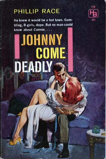
HILLMAN 179. Paperback original, 1960.
From the back cover:
Johnny was just a crap game hustler, but when he blew into town they pegged him wrong. The cops said, “Killer,” and slugged him simple. “Lover,” the rich gal said, and got him even worse mixed up. Next came the ex-striptease queen with the heart of gold or pewter, and the Happiness Boys from the Syndicate…
All Johnny had going for him was fast pair of legs, a faster set of wits, and just maybe, the one female around who could be counted on to win it or lose it for keeps. A fickle broad named Lady Luck.
December 16th, 2007 at 1:17 pm
Steve,
This has got to be the funniest title, cover, blurb and author pseudonym seen in ages.
It sure evokes an era when men wanted to read about tough guys who move into a corrupt town and clash with the underworld.
December 16th, 2007 at 1:26 pm
Just another piece of our cultural history, no matter how you slice it, that’s for sure!
— Steve
December 17th, 2007 at 11:44 am
Well, er, I’m not really sure why the interest in this rather undistinguished cover, but you could look it up in Holroyd (page 313) like I did and discover that it’s by Darcy!!! Darcy is a rather mysterious figure in the illustration art world, but he did a lot of covers in this time period. I don’t have the Hillman Johnny Come Deadly title, having gotten rid of most of my Hillman’s last year, but Hillman 129 (Robert Ackworth The Moments Between) is signed by Darcy and the artwork has the same look and feel. I’d say we’re lookin’ at a Darcy, even though I don’t know Holroyd’s source and he is known to have made a mistake or two in his price guide.
Cheers!!
Dan
December 17th, 2007 at 12:12 pm
It’s a good thing I didn’t guess, as Darcy wasn’t one of the artists I was thinking of at all. It’s a name I’ve seen often enough on covers, but I have to admit that I hadn’t paid him much attention until now. I’ll set up a gallery of some of his other work. He did a lot of covers for Beacon, but he seems to have worked for almost everybody: Dell, Gold Medal, Avon, Pyramid, all of them.
August 29th, 2008 at 10:37 pm
For the record, I’m reading another Philip Race book right now. (Picked it up for the cover, and never even meant to open it, but found myself in a mountain cabin on a cold, rainy day. Honestly.)
Anyway, the book — “Killer Take All,” Gold Medal, 1959 — is great if you like hard-boiled period stuff. It has all the usual cliches — every dame is gorgeous and wears tight clothing; gangsters speak with Ivy League inflections. But the story rips along, and the protagonist is suitably Camus-ian.
There’s just one thing, and it’s kind of strange. “Race”/Parsons seems to have a thing about describing eyes. Consider this: “His face had regained its accustomed blankness; the eyes looked like two pearl onions in a creme de menthe frappe.” What? And then, a few pages later: “He looked at me directly. He had eyes like soft-boiled lemon drops.”
Creme de menthe frappe? Soft-boiled lemon drops? One gags at the very thought, and is simply mystified by what kind of eyes to picture.