Covers


   Yes, in case you were wondering, I do indeed take requests. This one’s from Michael Grost, whose website A Guide to Classic Mystery and Detection is one you should visit and revisit often. I know I do.

   Said Mike, in a recent email:

   Steve, Victor Kalin did two different covers for Rinehart’s The Window at the White Cat. One is a sort of pun, in which a house also forms a cat face. The other shows a rainy building. Both are very good. His two covers for The Case of Jennie Brice are also atmospheric.    — Mike

   Victor Kalin is a favorite of mine also. He did ‘dark and gloomy’ very well, which meant he did a lot of covers for the gothics in the 1960s and early 1970s, but from the 1950s on, his work appeared on all kinds of mystery fiction, not to mention the occasional western or SF novel. I’ll set up a Cover Gallery for him in a day or so.

   To see what Mike means about the cover, you won’t if you’re sitting too close to the screen. You may have to move yourself backward, or refocus your eyes, to obtain the full effect. (Or vice versa, as the case may be.)

Mary Roberts Rinehart - Window at the White Cat

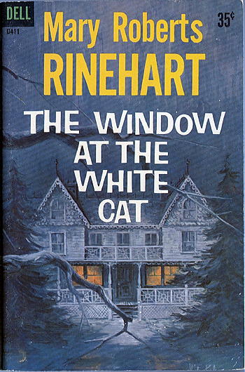
DELL D411. Paperback reprint: 1st printing, new Dell edition, March 1961. Previous Dell edition #506 [mapback], with many other later reprintings. Hardcover edition: The Bobbs-Merrill Co., Inc., 1910.

      From the back cover:

         Politics and Poker

that was the occupation and the preoccupation of the members of the White Cat Club.

Once on the inside, a man’s business was his own and nobody gave a damn if he was the mayor of the town or the champion poolplayer of the first ward.

It was a noisy, crowded, masculine kind of retreat, which explained the sign that hung proudly over the door:

         “The White Cat Never Sleeps.”

But murder entered the wakeful chambers of the White Cat and its victims slept the deep, long sleep of the dead.

   It was Dan Roberts who identified the cover artist for the Philip Race book a couple of posts ago, thanks to the timely assistance of Graham Holroyd’s Paperback Prices and Checklist.

   Darcy is the name, and at the moment it’s the only part of his (or her) name that I know. Here are a few other covers in the artist’s portfolio:

Darcy: McKimmey

Darcy: Williams

Darcy: Rabe

Darcy: Beacon

   Once again, I don’t have a name to go with the artwork on this cover. I’ve shown this book to a number of people, and not many of them remember that Bantam ever published James Bond’s adventures. Everybody remembers the Signet books, of course, since they came out when Bond’s popularity was the highest, and there’s a slew of those around.

   Fleming died in 1964, and this book came out in 1971. Even though the movies were still going strong — weren’t they? — I don’t think the Bantam editions sold well. I almost never see them anywhere myself, and I doubt that I have a full set. (Assuming, that is, that Bantam did a full set.)

IAN FLEMING Casino Royale

BANTAM, paperback reprint, May 1971. Hardcover edition: Macmillan, March 1954. UK hardcover: Jonathan Cape, 1954. Also published in paperback as You Asked for It, Popular Library, 1955. Other paperback edition: Signet, February 1960.

      From the back cover:

Millions of readers and countless filmgoers the world over have met British Secret Service agent James Bond — 007 — the superhero with an enormous appetite for the good things in life — food, women and international intrigue.

———

In Casino Royale, 007 faces one of his keenest adversaries, the Communist agent Le Chiffre, across the gaming tables of a famous French casino. The game is baccarat; the stakes are high: life and death.

———

Read the James Bond thriller From Russia, With Love. A Bantam Book.

   I might be able to make a reasonable guess as to who the cover artist is, but since there’s no indication and I’m not sure, I’ve decided not to make myself look foolish. Philip Race was the pen name of E. M. Parsons; he wrote three crime fiction novels under this name, the other two for Gold Medal; and one as Parsons, that one for Avon.

PHILIP RACE Johnny Come Deadly

HILLMAN 179. Paperback original, 1960.

      From the back cover:

JOHNNY ON THE SPOT

   Johnny was just a crap game hustler, but when he blew into town they pegged him wrong. The cops said, “Killer,” and slugged him simple. “Lover,” the rich gal said, and got him even worse mixed up. Next came the ex-striptease queen with the heart of gold or pewter, and the Happiness Boys from the Syndicate…

   All Johnny had going for him was fast pair of legs, a faster set of wits, and just maybe, the one female around who could be counted on to win it or lose it for keeps. A fickle broad named Lady Luck.

   The following paperback was published in the dark Middle Ages when cover artists were seldom identified. There’s not even a hint of a signature to use as a clue. As far as the cover is concerned, look closely. This is one that tells a complete story, in and of itself.

Anna Clarke: The Poisoned Web

CHARTER. Reprint paperback, May 1990. Hardcover edition: St. Martin’s, 1982. Prior UK hardcover edition, Collins Crime Club, 1979.

      From the back cover:

LOSING PATIENCE
———
Once Patience Merriman had been the toast of Oxford. But now
the professor’s aging widow is confined to a wheelchair, and she
aims her bitterness at anyone within range. She ridicules her
daughter Romola. She schemes to destroy the romance between
the two young students boarding upstairs. And her latest ploy is
promoting the scurrilous suggestion that her own daughter
intends to do her in. Once the accusation is made, though,
she wonders if she’s made a mistake. This suggestion
might be too good to pass up…
———
A MASTER OF MYSTERY
———
Anna Clarke has joined the ranks of Dorothy Salisbury Davis,
P. D. James, and Josephine Tey in capturing our imagination with
crimes of the heart. Her successful series of detective fiction
shows us once again that the dark deed of murder is born in the
place of our deepest passion.

   I’m not exactly sure why I’m attracted to this cover. Sometimes perhaps simpler is best. The cover design is attributed to Michael Accordino. Google suggests that he was the art director at Simon & Schuster at the time.

Lia Matera: Havana Twist

POCKET. Paperback reprint, November 1999. Hardcover first edition: Simon & Schuster, May 1998. The same cover design was used for each.

      From the back cover:

Never before have the stakes been so high, or so personal,
for “one of the most articulate and surely the wittiest of
women sleuths at large in the genre” (The New York Times
Book Review
). As she investigates the mysterious
disappearance of her own peacenik mother, Willa find
herself doing the
HAVANA TWIST

   Attorney Willa Jansson has finally managed to unload some of her sixties baggage, but her rebellious mother can’t seem to mellow out. When Mom heads for Cuba with a band of graying “brigadistas” Willa figures it’s just a pilgrimage to lefty Graceland. But then the rest of the group returns without her mother, and Willa fears the worst. Risking disbarment for “trading with the enemy” she rushes to the rescue — and discovers that her mother may have finally gotten into more trouble than she can get herself out of.

   In a deadly game of cat and mouse, Willa follows her mother’s path from Havana to Mexico City, from California back to Havana, getting manipulated, misled, and nearly arrested along the way. Soon she finds two angry governments, at least one ruthless killer, and her old flame, Lieutenant Surgelato, are hot on her trail. Racing against time, Willa realizes that, much more than politics and police work, it is intuition that will help her find her mother — and those things that only a daughter knows.

“The best Jansson adventure yet — and that’s
saying a great deal.”    — Booklist

   The artist signed his name to this cover, but only the top half of the lettering shows. It’s along the bottom edge, over to the right. If someone has a copy of the hardcover edition, the artwork is the same, and the signature is intact. I like the fine line work, and the coloring.

Monsieur Pamplemousse Aloft

FAWCETT CREST Paperback reprint, October 1990. Hardcover edition: Fawcett/Columbine, September 1989. Both publishing imprints were part of Ballantine at the time. First edition: Hodder & Stoughton, UK, hardcover, 1989.

      From the back cover:

MONSIEUR PAMPLEMOUSSE TAKES
TO THE SKY — AND IT MAY NEVER
BE THE SAME AGAIN!

   France’s most prestigious restaurant directory, Le Guide, has pressed culinary expert Monsieur Pamplemousse into delectable service. His mission: create a dining extravaganza for the maiden voyage of a luxury dirigible carrying the French and British heads of state.

   But Monsieur Pamplemousse senses disaster even before leaving the ground. First his car is run off the road by a van full of nuns, then a local circus performer and new-found friend, Yasmin, suffers a terrible “accident” on the trapeze.

   All is certainly not well, but Monsieur Pamplemousse suspects the mystery and misfortune will soon lift — abound the celebrity blimp!

———

    “The funny, exciting mystery will delight readers who may weep with envy of the feasts that are ordinary fare for M. Pamplemousse and Pommes Frites.”
      PUBLISHERS WEEKLY.

   Cover art by F. Accanero. A quick search on Google brings up a handful of other paperbacks he did the cover art for, mostly as Franco Accanero, but once again, no website.

Wellman: Holmes & War of the Worlds

WARNER paperback original; 1st printing, September 1975.

      From the back cover:

The War
of the Worlds …

so terrifying, it rocked the world
when H. G. Wells reported in 1897
— and again, in 1938, when Orson Welles
broadcast it.

But there was far more to the story than was ever told. Two of Sir Arthur Conan Doyle’s most famous characters, Sherlock Holmes and Professor Challenger, played pivotal roles in the historic happenings. Here are the facts, never before revealed, of the confrontation: two of the most remarkable intellects the Earth ever produced pitted against beings intelligent enough to conquer space. Read now —

how Holmes and Challenger knew
an invasion was coming.

how they survived the occupation of London

how they captured an alien invader

how they deduced the origin of the invaders

the reason for the landings — and the fatal flaw
in the plan for conquest.


[A PERSONAL NOTE] The cover’s really only OK. Leaving off the Holmesian pipe and cap, it’s a fairly generic sci-fi cover and to my mind, not particularly eye-catching.

   There is a reason why I’m posting it here, and you can believe the story or not, as you wish, but it is true.

   I don’t always remember where or when I bought a particular book I have in my collection, but sometimes I do, and I’m sure it’s the same way with you. And I certainly do in this case, and here’s why.

   My daughter Sarah and her husband Mark had been living in Illinois for only a year, no more than two, as I recall — Charleston, in fact, if you’d like to look them up — and to entice me to visit, besides of course the obvious, Sarah mentioned that there was going to be a library sale somewhere in St. Louis where, it was said, they were going to be offering a million books. (I may have the number wrong. Maybe it was only half a million.)

   So of course I went. I saw the sights in Charleston (other than Sarah’s school, it didn’t take long) and in Champaign-Urbana, where Mark works (that took a little longer), and we checked out all of the bookstores anywhere in between.

   Came Saturday, we all got up early and drove the couple of hours over to St. Louis. There were lots of books, but the sale was rather disappointing. Maybe if I didn’t have to mail back anything I found, I would have bought more, but I don’t think I spent over $60 or $70. This is for paperbacks at 50 cents each, so it was a sizable amount, but I didn’t buy nearly as many books as I’d expected. (I’ve spent as much as $200 at some sales.)

   Anyway, this book by the Wellmans (father and son — in fact, Wade Wellman is actually Manly Wade Wellman, Jr.) was one of the books. So I know exactly where I bought this book and how much I paid for it.

   Well, here now comes the part that you’re not going to believe, and I wouldn’t either, except I was there. I opened the book up to glance through it, to see if it was worth keeping — the condition’s not entirely the best, as you can see — and inside was a bookplate.

   My head spun for a moment, I collected my thoughts and looked again. If I could carry a tune, I suppose I could have heard the theme for the Twilight Zone. The book was not mine — I hadn’t paid for it — and it never had been. I’d never seen it before in my life.

   I solemnly swear that the above story and final statement is true.

            Signed on this date, December 6th, 2007.

                      Steve Lewis

Wellman: Holmes & War of the Worlds

   Cover artist identified as Cliff Miller, a commercial artist who’s done hundreds of paperback covers (mysteries, science fiction, Nancy Drew), but so far I haven’t been able to find a website for him.

Schutz: The Things We Do For Love.

BANTAM paperback reprint, April 1990. Hardcover edition: Charles Scribner’s Sons, February 1989. [Fourth in the Leo Haggerty series.]

      From the back cover:

“A SIZZLER.”    — Publishers Weekly
             ———
         SWEET JANE vs. THE BAD GUYS

   Escorting a young rock singer from the airport to his Washington hotel and guarding the door of her penthouse for the night sounds like a piece of cake to Detective Leo Haggerty. Sure, Jane Doe of the Pleasure Principle has gotten some death threats, but what celebrity hasn’t? To Leo, this small job sounds like sweet financial gain with a minimum of pain — and Jane’s real easy on the eyes.

   The headstrong songwriter does have some real enemies, though. For starters, the guys in her bad are furious that she won’t sell out and sign a major-label contract with them — but that’s no reason to kill somebody, is it? When the cushy job explodes into violence, Leo has to put his life on the line — or Jane might make the hit list before she even puts an album out.

         THE THINGS WE DO FOR LOVE
             ———

The Things We Do for Love is a credit to … the hard-boiled private eye tradition. The prose is lean .. .with colorful touches along the way.”     — The Philadelphia Inquirer.

Cover artist: Edward Gorey.

Sarah Caudwell: The Sybil in Her Grave

DELL. Paperback reprint: July 2001. Hardcover First Edition: Delacorte Press, July 2000. [The same artwork was used on both.] Published posthumously.

      From the back cover:

“Marvelous… Combines wit and forbearance, intellect and passion,
above all, humor and perfection of language.
Sarah set out to write a classic English village crime story,
complete with vicar and mad virgin, and here it is,
together with Hilary Tamar and the brilliant, sexy, young lawyers
at the Chancery Bar.”     — Amanda Cross.

Julia Larwood’s Aunt Regina needs help. She and two friends pooled their modest resources and invested in equities. Now the tax man demands his due, but they’ve already spent the money. How can they dig themselves out of the tax hole? Even more to the point: Can the sin of capital gains trigger corporeal loss?

“Brilliant.”     — Chicago Sun-Times.

That’s one for the sibyl, psychic counselor Isabella del Comino, who has offended Aunt Regina and her friends by moving into the rectory, plowed under a cherished garden, and establishing an aviary of ravens. When Isabella is found dead, all clues point to death by financial misadventure.

“The humor is wicked, but the intelligence behind it
is smart and sweet.”    — The New York Times Book Review

So Julia calls in an old friend and Oxford fellow, Professor Hilary Tamar, to follow a money trail that connects Aunt Regina and her friends to what appears to be capital fraud — and capital crime. The two women couldn’t have a better champion than the erudite Hilary, as once again Sarah Caudwell sweeps us into the scene of the crime, leaving us to ponder the greatest mystery of them all: Hilary, him — or her — self.

“Clean elegant, observant and witty.”     — The Washington Post

« Previous PageNext Page »